
Redesigning a Banking Website to Stay Competitive
Client:
Bank of the Philippine Islands (BPI)
Project background
Bank of the Philippine Islands (BPI) is the oldest bank in Asia, offering a wide range of banking products to an estimated 6 million users locally and overseas. With a focus on continuing to provide the best services to their users, the bank had to upgrade their technology, and I was part of a design team that assisted BPI in migrating their decade-old content to a new Content Management System (CMS) platform.
MY SCOPE OF WORK
Heuristic evaluation (L.E.A.D)
User flow mapping
Wireframes
Iconography design
DESIGN TEAM
1 UX Director
1 UX Lead
3 UX Designers (Me)
5 UI Designer
Project purpose
BPI was suffering from a decrease in market share due to rising competition in the online banking space — banking, credit cards, loans, investments, etc. The poor user experience and manual application processes had turned away many consumers. As a result, an overhaul was necessary to address challenges across two segments:
business challenge:
1. Outdated CMS limiting scalability and causing content inconsistencies.
2. No design system to govern website and app component consistency.
3. Poor differentiation between personal, preferred, and business banking.
Consumer challenge:
1. Unable to complete task due to broken or missing call-to-action (CTA).
2. Poor self-service content due to missing and obsolete information.
3. Manual application process requiring a fax or physical store visit.
Project outcome
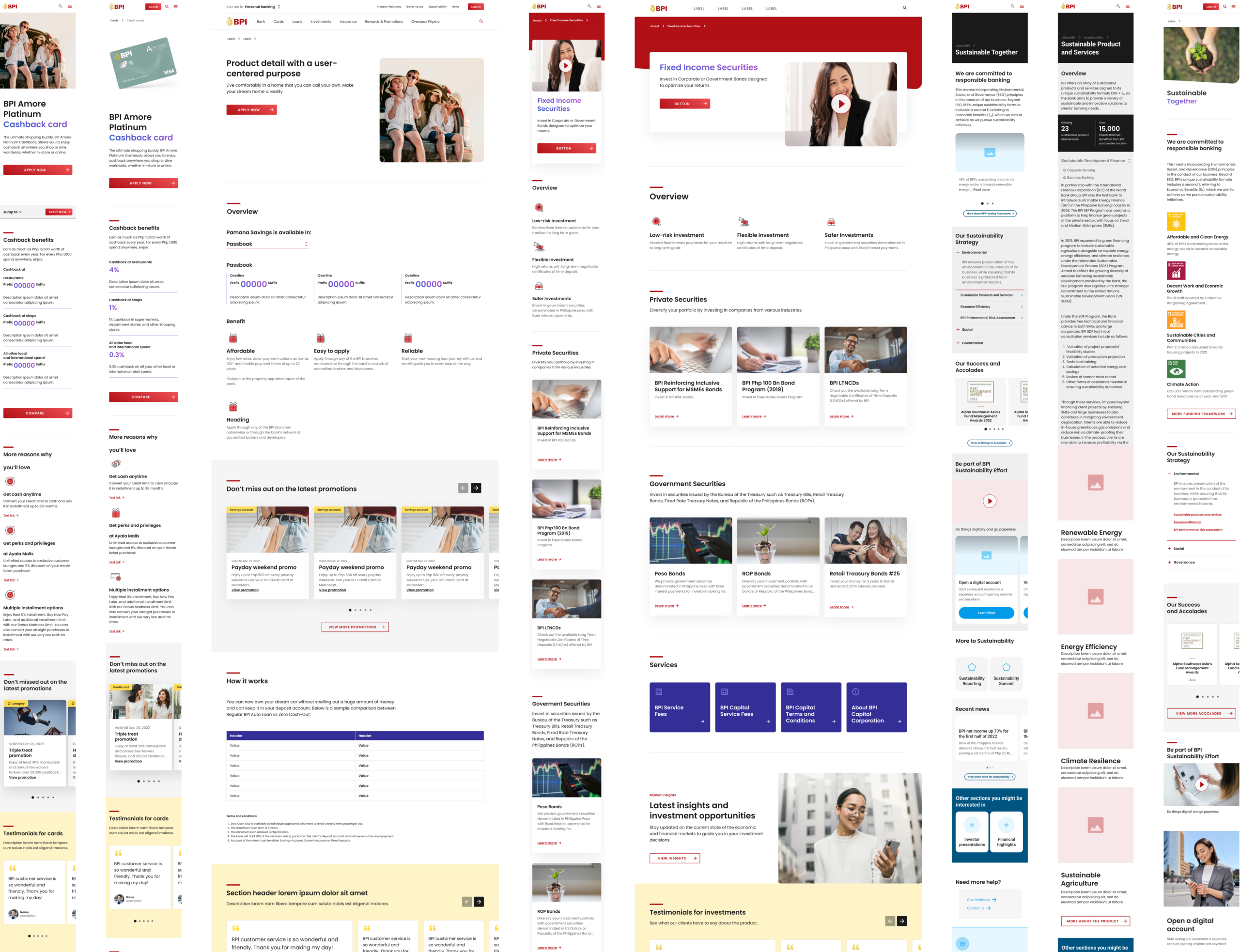
After the CMS was replaced with Adobe Experience Manager, the information architecture (IA) and user flows were redesigned, and a design system was implemented. The results demonstrate the success of the transformation:
Note: The product application process is not part of this transformation, as it falls outside the project scope due to governance differences.
50%
Increase in loading speed
8 months
Design to implementation phase
80+
Component built
762 pages
Built through scalable designs
discover & define
THE WORK
1. Audit design across multiple journeys
During the discovery phase, we had to uncover the challenges users faced when navigating the entire BPI website — including personal banking, overseas banking, business banking, and wealth management. To conduct an unbiased audit at this scale, the L.E.A.D framework was introduced. I collaborated with a UX Lead and a Senior UX Designer throughout this process.
How does L.E.A.D work?
L.E.A.D is an acronym for Light, Ethical, Accessible, and Dataful. Each word carries a set of metrics that measures a product's maturity in different areas — similar to Nielsen's 10 Usability Heuristics, but elevated with quantifiable scoring that also enables benchmarking against competitors' products.
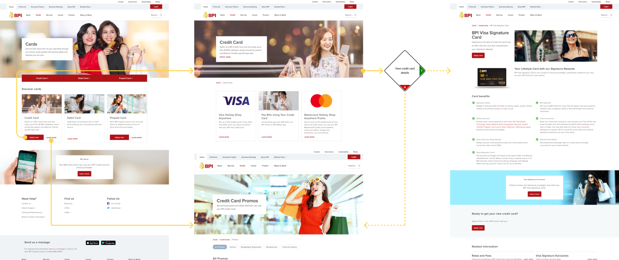
First, we defined the user goals for each website — for instance, the personal banking goal was to apply for a credit card. We then simulated the user journey by screenshotting each page until the task was completed, repeating this until all user journeys were documented. We then evaluated each screen using post-its mapped to each L.E.A.D criteria. In total, we audited 8 websites and 80+ user journeys.
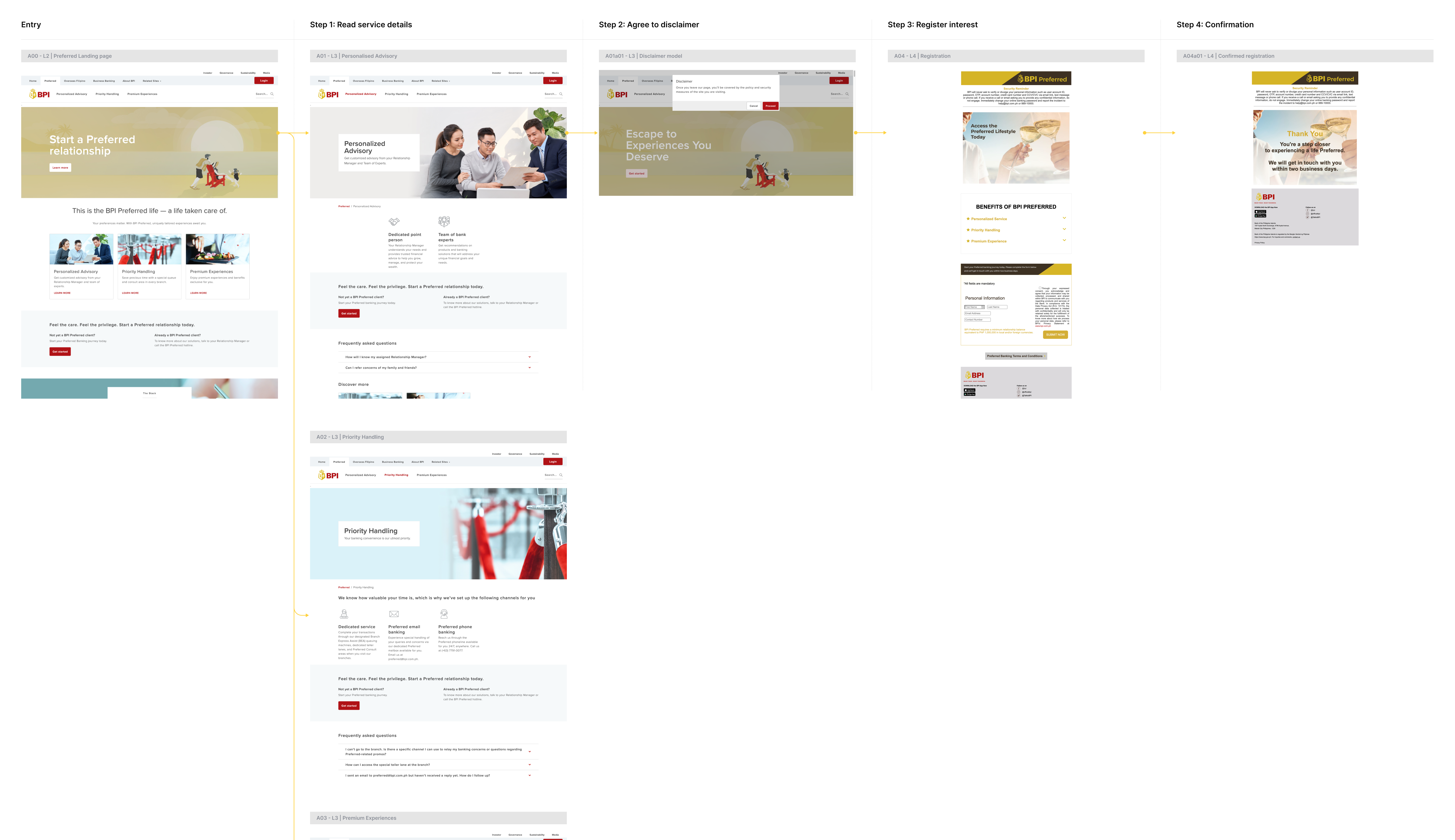
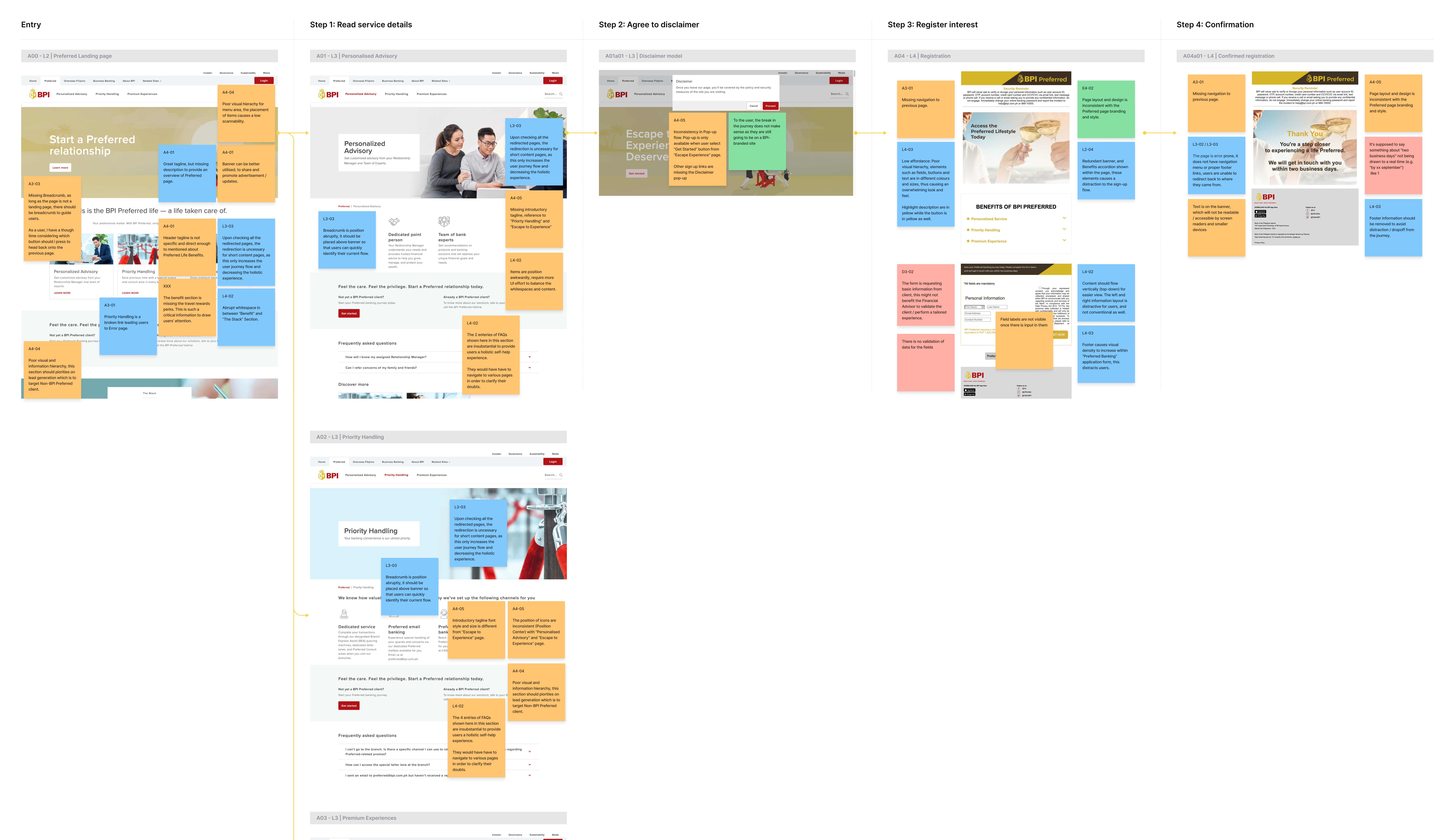
Example of user journey before and after evaluation.
2. Synthesis and cluster massive data
The process of noting each pain point on a post-it generated a large volume of data. However, because the post-its were already categorised by L.E.A.D, organising them was straightforward — we grouped each post-it by category, for instance, placing all Light items together per website.
Once organised, we converged the post-its into a single overarching insight per site, then clustered these further into high-level findings to inform stakeholders of the critical issues across the entire BPI website.
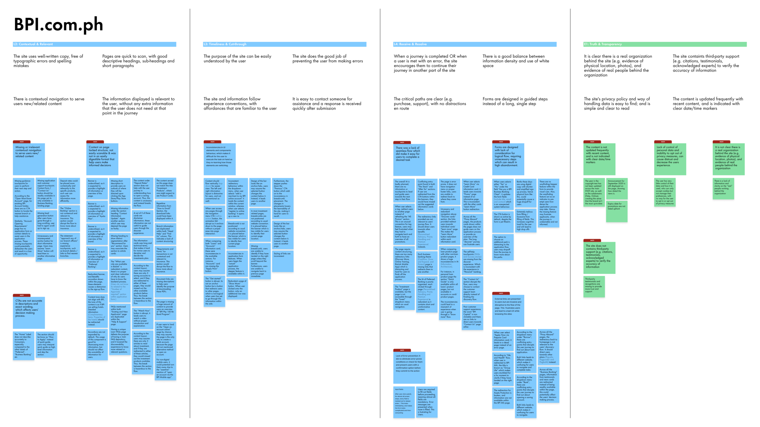

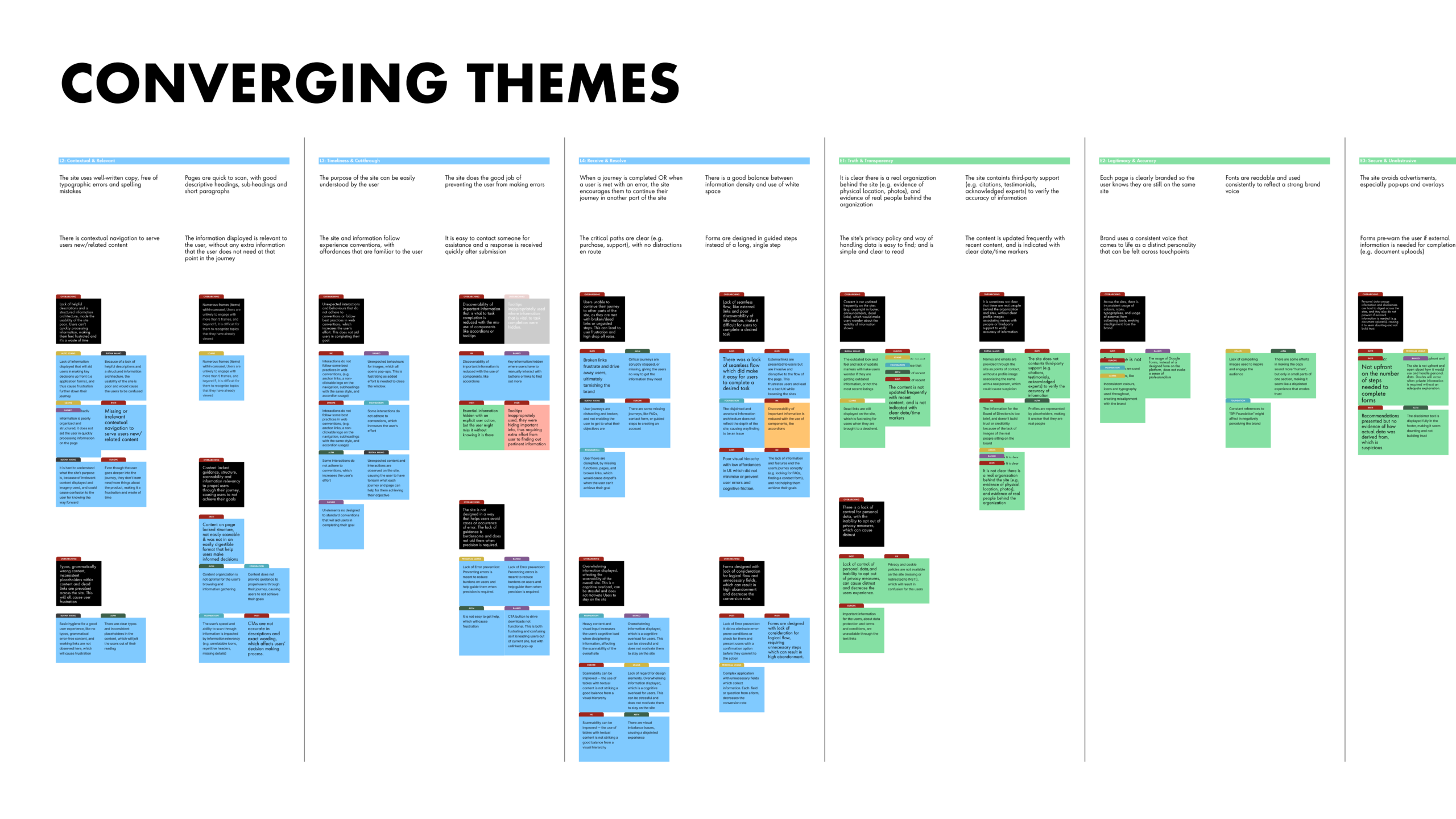
Example of how categorisation was conducted.
3. Evaluate and compare performance
While clustering the post-its, we simultaneously scored each website's maturity using a spreadsheet formulated to provide an average score across Light, Ethical, Accessible, and Dataful. The same scoring system was also applied to conduct a competitor analysis, ensuring an unbiased benchmark.
Together, the scores and high-level findings formed the backbone of our report — giving stakeholders and UX designers a credible and actionable basis to apply during the design and delivery phase.
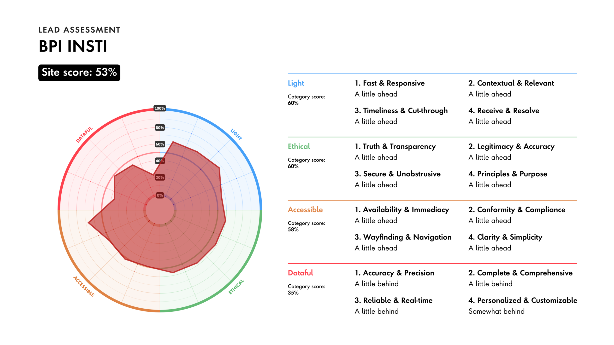
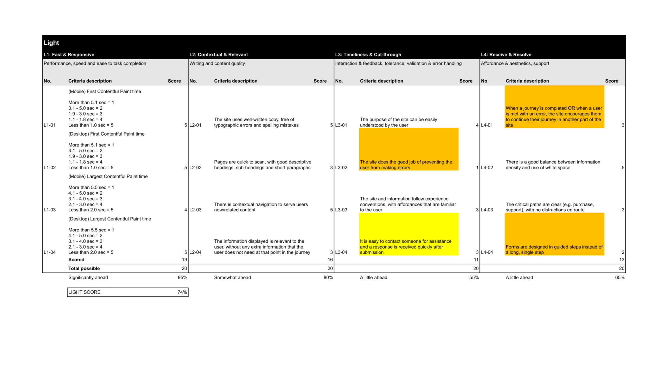
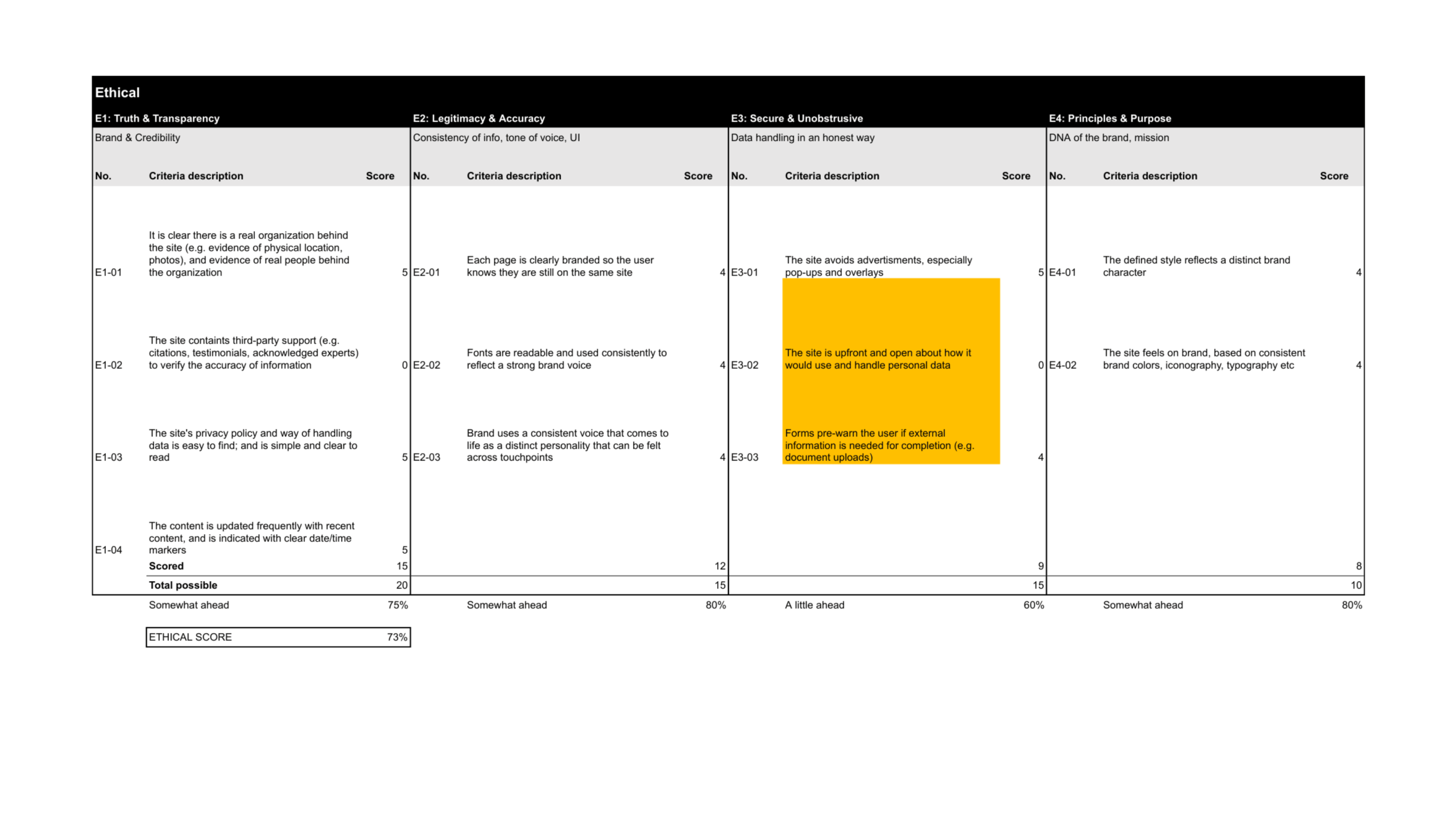
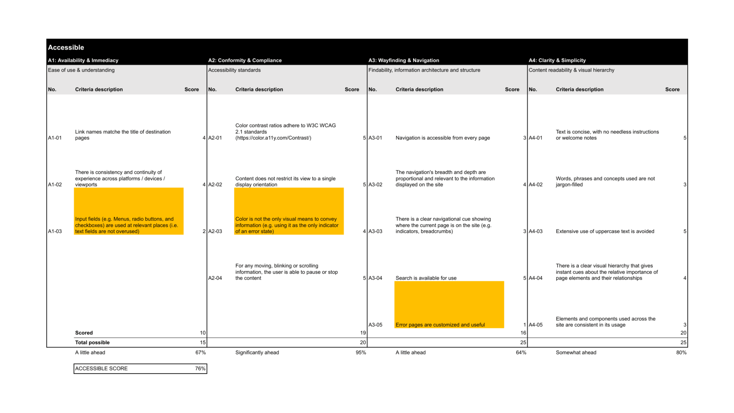
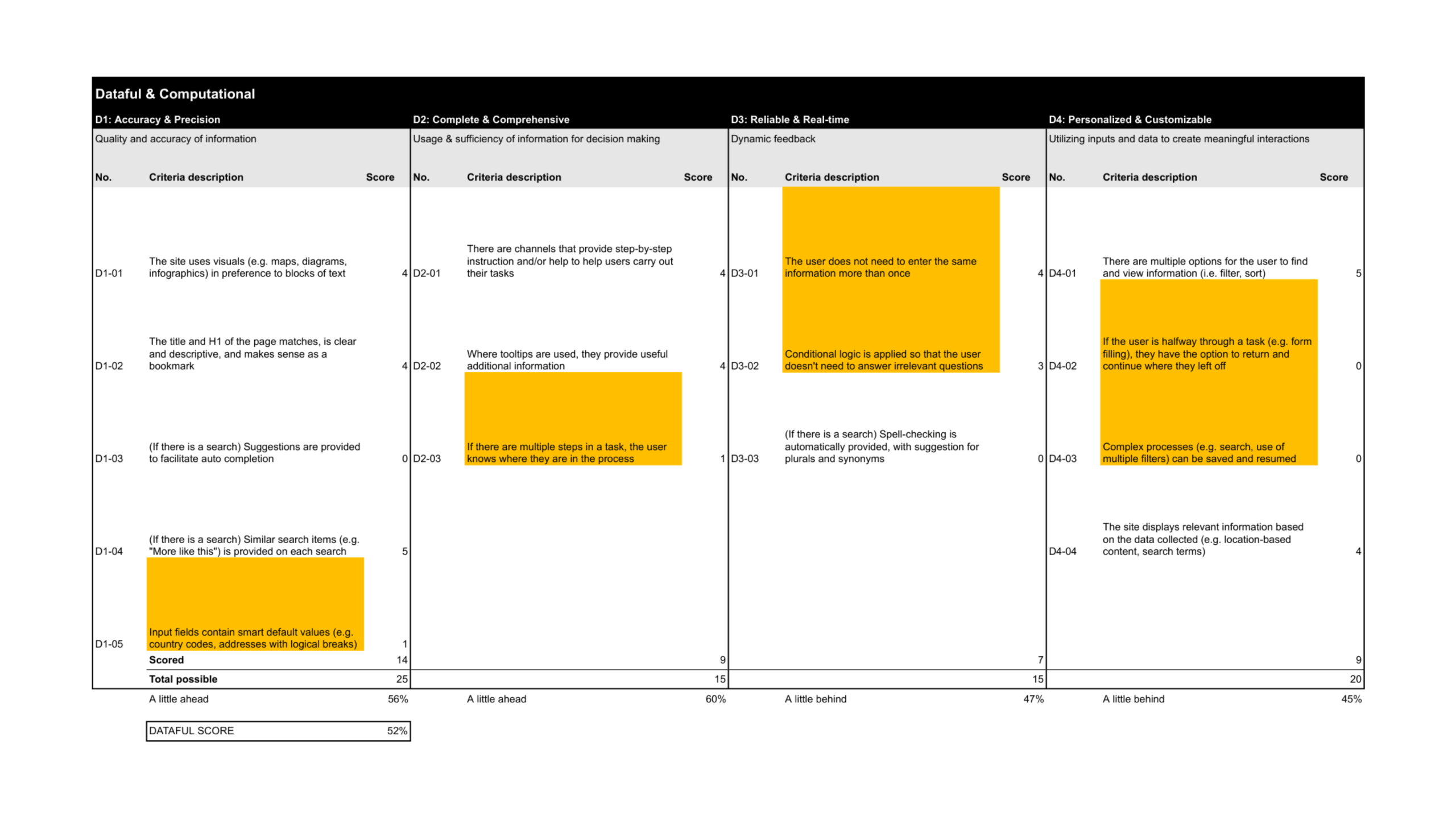
Example of design audit report and tabulation via spreadsheet.
design & deliver
THE WORK
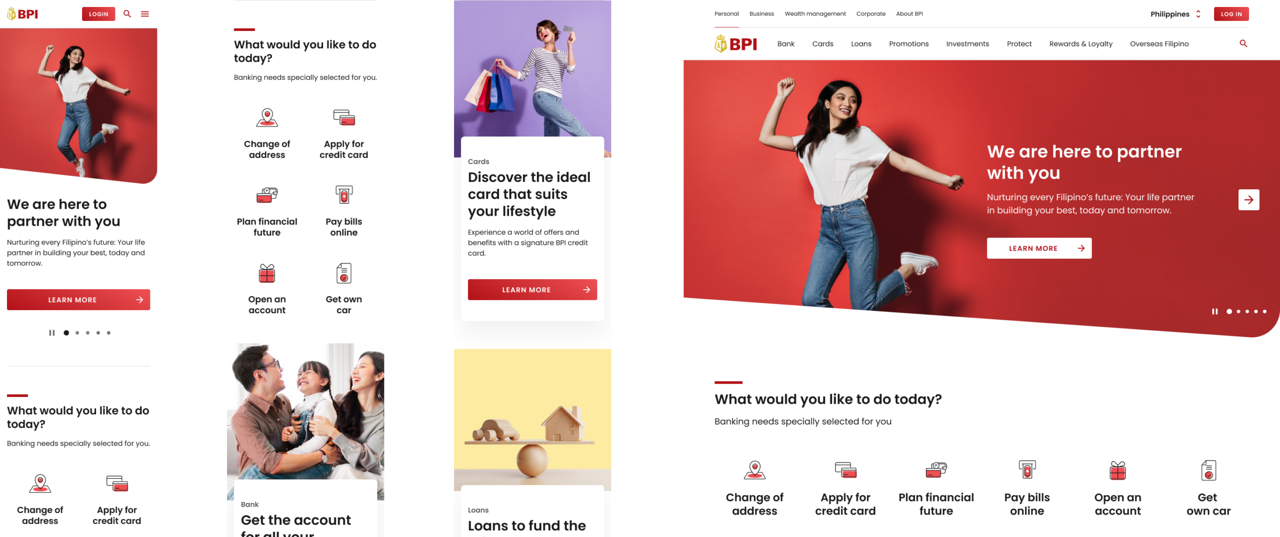
1. Advocate user needs through content
By the wireframing phase, the user flow and content structure had already been established by the content strategists. All I had to do was pick up user stories and start designing. I started with my first Jira ticket — Sustainability under About Us.
Upon comparing the user story against existing Sustainability page, I was not convinced by the structure. It felt like we were replicating existing content rather than addressing what users actually needed — we should have been retiring obsolete information and minimising low-traffic pages instead of migrating them across.
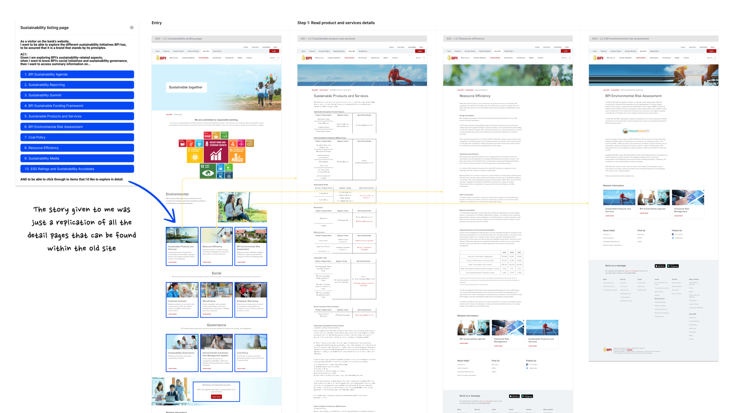
Example of user stories and original Sustainability pages.
So I consulted my UX Lead to proposed a revised user story and content structure. I then brought this to the content strategist for approval, which they signed off on — opening the door for the design team to make more informed, user-centred decisions beyond the original brief.
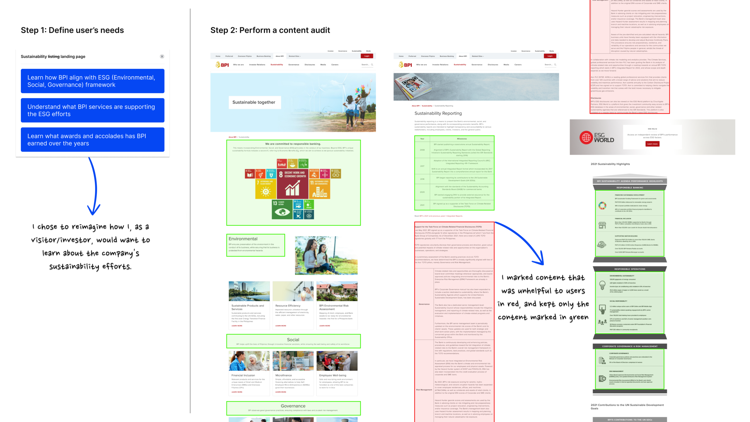
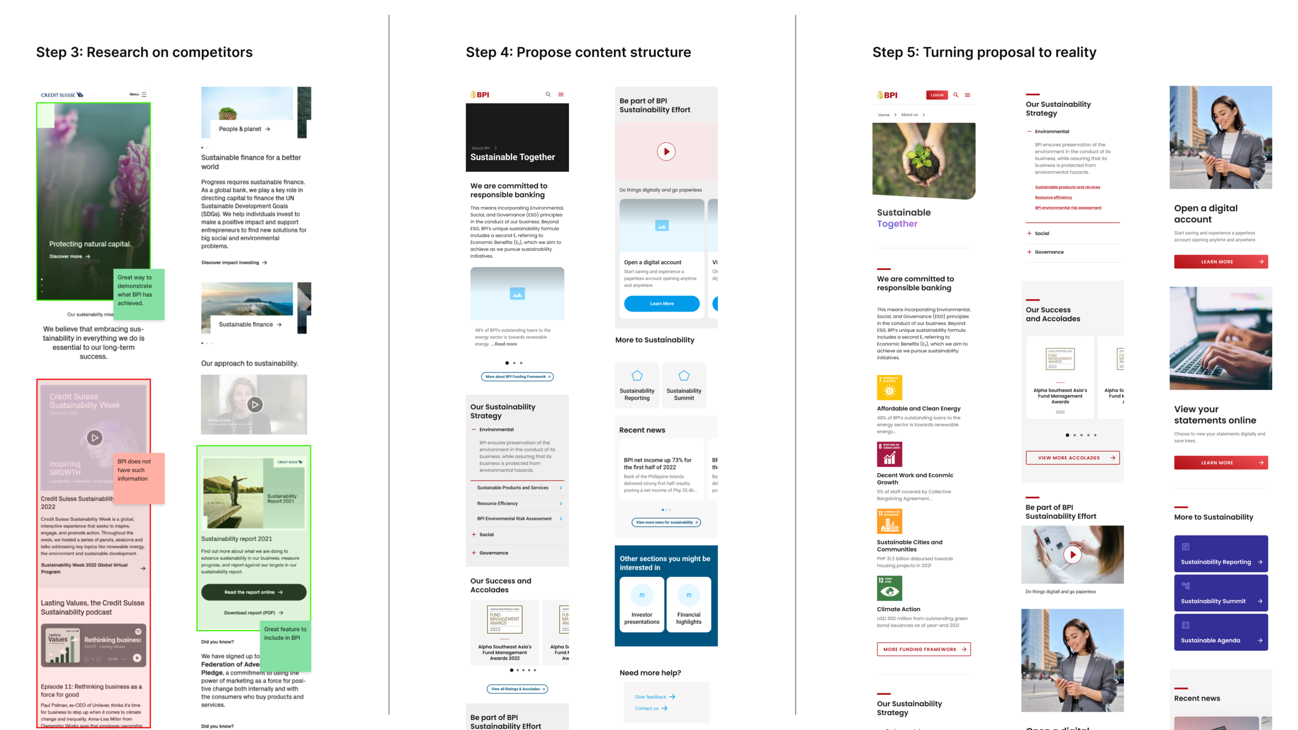
Result of wireframes with proposed structural changes.
2. From create-new to reuse-first mindset
Moving from sprint 1 to sprint 2, we noticed growing inconsistencies across our wireframes. With four UX designers working simultaneously on different pages, each had defaulted to creating new designs instead of reusing existing components. This left UI designers unable to tell whether the differences meant new functionality, or just inconsistent design.
To address this, we ran design-sync sessions to help UI designers clarify each component — variant, or separate component. From there, we set usage rules defining when each should be used.
This pushed UX designers to reuse components instead of defaulting to new ones, boosting efficiency and building discipline around when to create something new. It also strengthened communication between UI and UX, keeping both teams aligned on component usage.
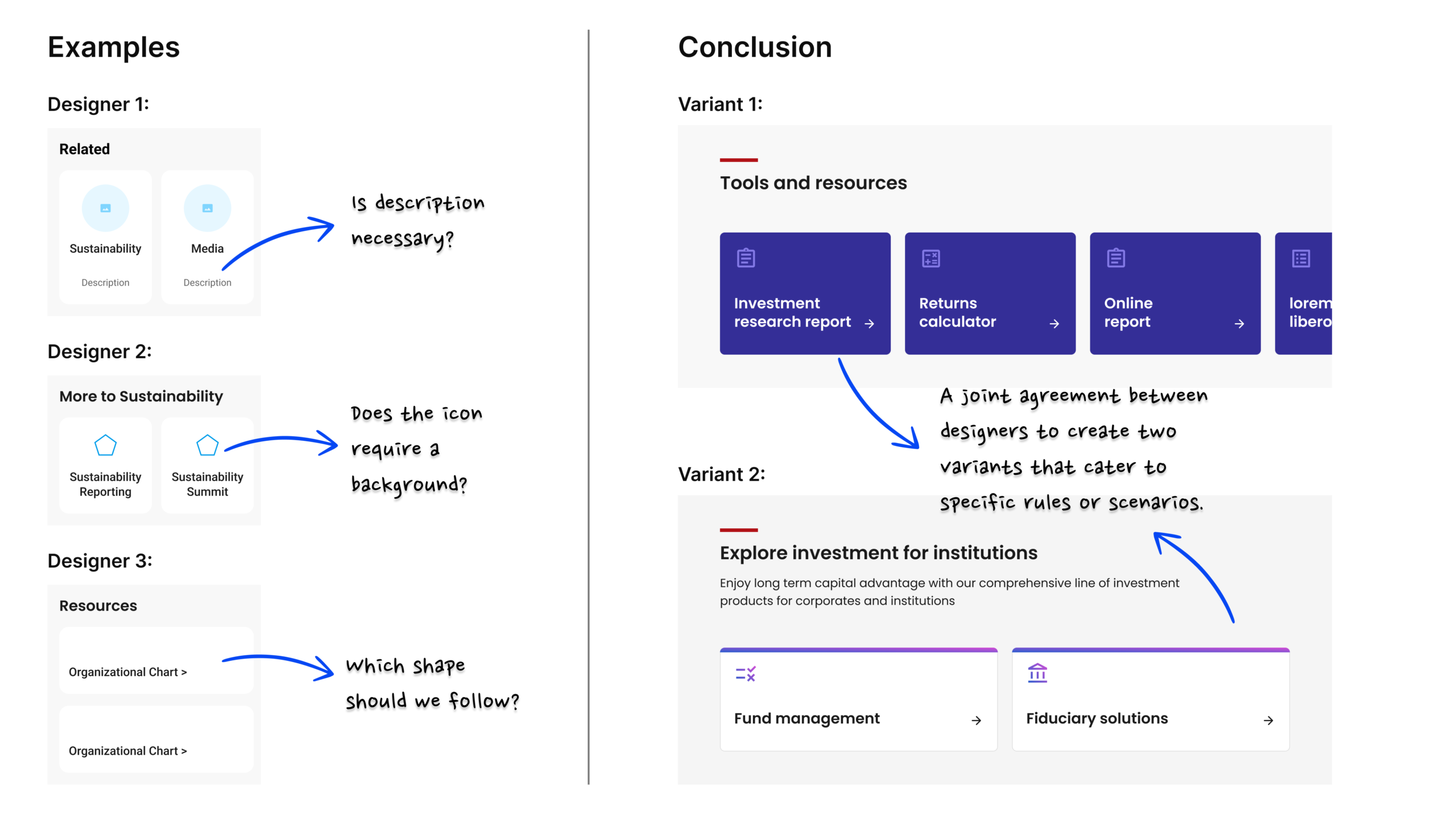
Example of different design variation that caused confusion.
3. Building a scalable icon system
While designing the product detail pages, I noticed every page — accounts, cards, and loans — had a feature/benefits section, but they all shared the same icon: a green tick. It offered no real visual aid, since users couldn't distinguish one benefit from another. Digging deeper, I found the design system covered icon sizing and construction, but had no guidelines on which symbols should represent which benefit.
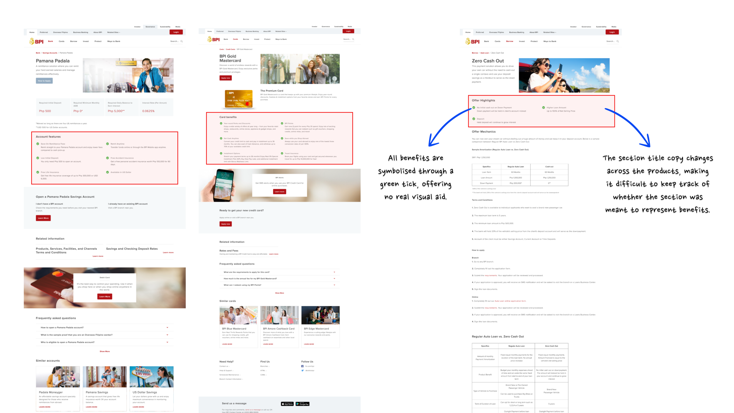
Example of a feature/benefit section using the same icon throughout.
I saw this as a chance to improve the experience across every product page, not just patch the icon. Without a standardised reference, the marketing team would have no scalable way to recreate or maintain these icons post-handover — so the fix had to be a system they could confidently apply and extend, not just a visual fix.
After flagging this with the UX Lead and client, I took the initiative to work on it alongside my sprint tickets — listing all products, mapping each benefit with a post-it, clustering them by context, then collaborating with a UI designer to bring the visual direction to life.
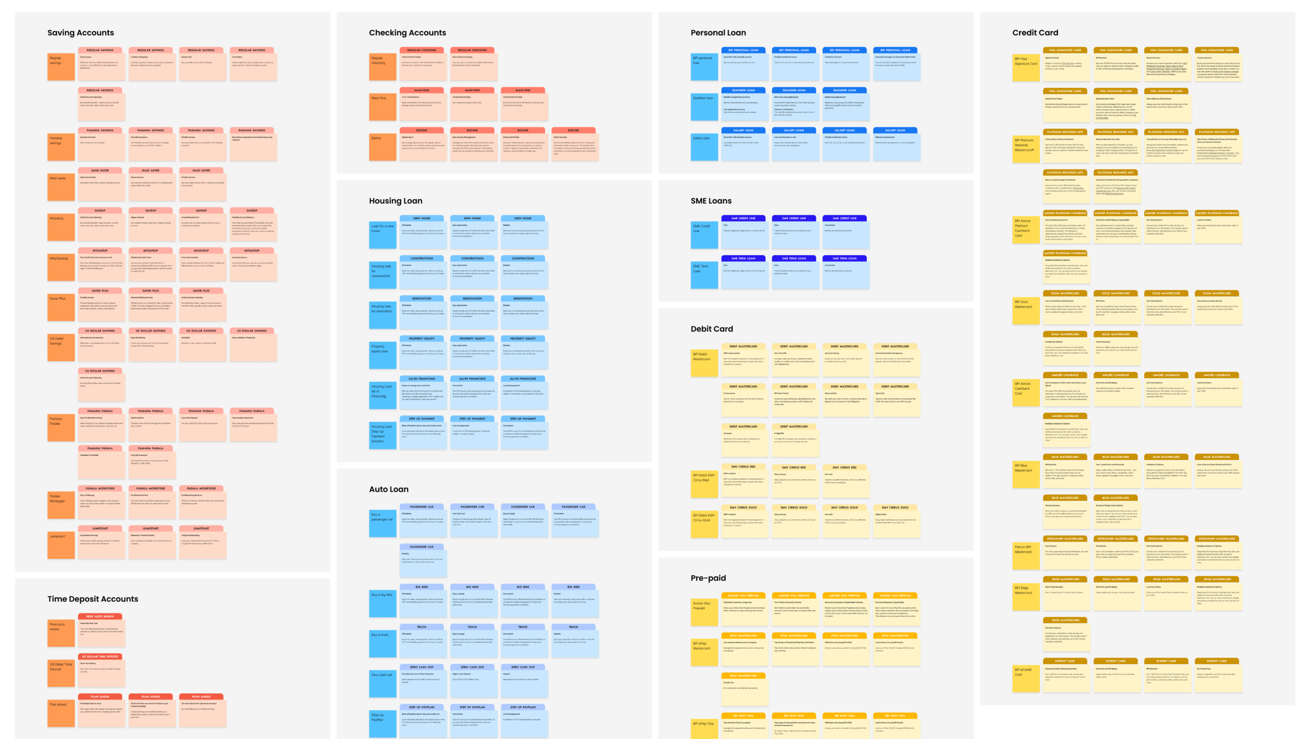
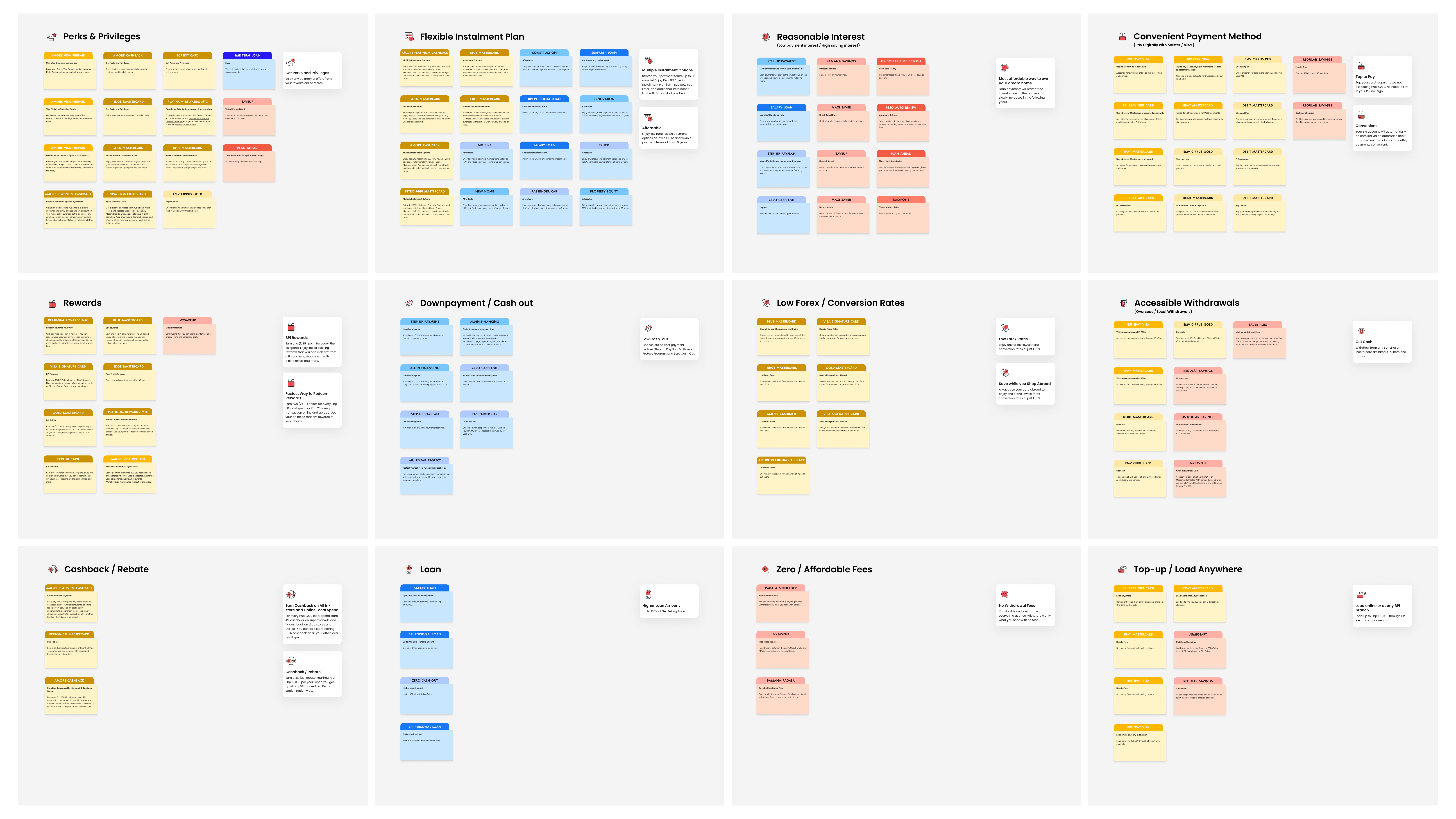
Example of icon system before and after categorisations.
From research to Reality
THE RESULTS
Lessons
and insights
Knowing the limits of a framework
Using the L.E.A.D framework for the first time, I found it invaluable for quantifying design audits. That said, its scoring system still has gaps — take the measurement Light (L2-01): "The purpose of the site can be easily understood by the user?" What criteria determine a full 5 out of 5?
Without a clear benchmark, scores can vary depending on who's evaluating. Understanding these limits has made me more mindful of how I apply and interpret frameworks in future audits.
Seek clarity over assumption
Joining the project midway meant I had to get up to speed quickly. I read through the project scope, personas, and service blueprint independently, and made it a point to raise questions with my Senior UX Designer and UX Lead whenever I needed clarity. It reinforced a belief I carry into every project — when in doubt, ask.
